What is the best way to ensure that we obtain the perfect exposure every time?
If you answered The Histogram, it’s 10 Easy Way points for you!
The Histogram can be a little odd-looking and confusing, however, it is a great tool and actually fairly easy to read, once we have an understanding of exactly what is being displayed.
Let’s take a look!
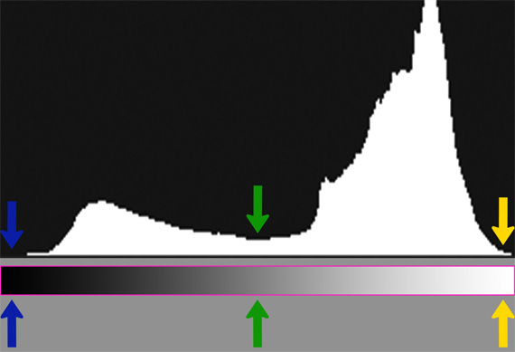
Below is an example of a perfect exposure Histogram.
What exactly are we looking at?
If you enable your Histogram on the back of your camera (which I highly recommend) you will see this odd looking mountain-shaped graph on the rear LCD each time you take a photo.
In the example below, I have also attached some further information to help us understand exactly what we are seeing.
Directly below the Histogram, in the Pink box is the range of tones (brightness) that the Histogram represents. See how within the Pink box, the levels of brightness range from Black on the far left to White on the far right.
To help you remember which side is black and which is white, just remember Bright = Right.
See the lower arrows are pointing to the brightness represented.
- The Blue arrow is pointing to the Black pixels, notice the histogram is showing no black pixels.
- The yellow arrow is pointing to the White pixels, notice the histogram is showing not many white pixels.
- The Green Arrow is pointing to the Mid Grey Pixels; notice there is a small amount of Mid Grey pixels.
How tall the white mountain graph is at any one point tells us how many pixels we have at that brightness level.
Which level of brightness in this graph contains the most pixels?
If you answered, Light grey or roughly between the green and yellow arrows. Correct! Another 10 Easy Way Points for you!!!
Our basic aim is to have no Pure Black and no Pure Whites showing in our Histogram.
Ok, let’s take a look at some not so perfect Histograms.
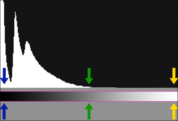
The Histogram below represents an underexposed photo.
Notice that at the Blue arrows, we have a huge spike of Pure Black Pixels pushed right up against the left edge of the Histogram.
Notice all the space between the green and yellow arrows that could have been used. We could have fixed this poor exposure by lengthening our shutter speed a little, which would result in a brighter photo, shifting the histogram to the right and filling up that empty space, reducing the number of pure black pixels.
Why are Pure Black pixels bad?
Blocking up the shadows: Once your histogram crashes into the left like below, you are now recording pure black pixels. The issue with pure black pixels is that they contain no detail other than pure black. All the detail within these areas is lost and not recoverable.
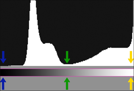
Below we have the opposite example.
The Histogram below represents an overexposed photo.
Notice at the Yellow arrows, we have a huge spike of Pure White Pixels pushed right up against the right edge of the Histogram.
Notice all the space near the blue arrow that could have been used. We could have fixed this by increasing our shutter speed a little, which would darken the photo and shift the histogram to the left, filling up that empty space and reducing the number of pure white pixels.
Why are Pure White pixels bad?
Blown Highlights: Once your histogram crashes into the right, such as in the example below, you are now recording pure white pixels. The issue with pure white pixels is that they contain no detail other than pure white. All the detail within these areas is lost and not recoverable.
Our aim is to try and contain the histogram within the left and right edges.
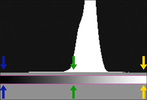
Is the Histogram below good or bad?
If your answer was good, correct! 10 more Easy Way points!!!
Below is an example of a photo with low contrast. All of the pixels are contained within a narrow range – roughly near the mid-grey region (green arrows). Our only goal is to stay between the left and right edge. Success! We can add contrast and spread the histogram later in post-processing.
Often you will see the histogram tower go through the roof like this. It is not an issue – we just have so many of the one brightness range that the graph cannot show them all.
In this case, when you have lots of room to play, you are slightly better off having the histogram favouring the right, such as in the example below.
Remember – through the roof is perfectly OK as long as it’s not smashed up against the left or the right sides.
Final Tip: Every now and then in extreme conditions (like shooting directly at the sun), you will not be able to contain the histogram within the edges, no matter what you try.
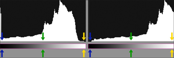
This is where bracketing (multiple exposures) comes in. Generally, 2-3 exposures are enough. See the example below.
Notice that in the left example below, we have contained the highlights (yellow arrow) and in the 2nd exposure (right), we have contained the shadows (blue arrow).
It is then a matter of blending the 2 exposures together in Photoshop to create one perfect exposure!
This week’s Photography Challenge.
- Enable your Histogram
- Take a photo and review the histogram
- Change your shutter speed
- Notice how that affects your histogram in the next photo
- Try and predict which way the histogram will move based on the change in shutter speed
- See if you can capture a photo with a Histogram not touching the Left or Right edges
P.S. Now that you have the Histogram dialed in, maybe it is time to conquer Photoshop once and for all!
Like This Article?
Don't Miss The Next One!
Join over 100,000 photographers of all experience levels who receive our free photography tips and articles to stay current:


Leave a Reply