Today’s case study on an award-winning landscape photo was kindly shared with us by Ignacio Palacios, author of the Dissecting Award Winning Shots which is designed to help photographers gain the confidence and understanding of how to build their images to an award-winning standard.
‘Ice Hole’ is a composite image created from two images taken in areas very close to one another geographically and is one of my favourite examples of how blending two scenes together can create an image far more engaging and impactful as a result.
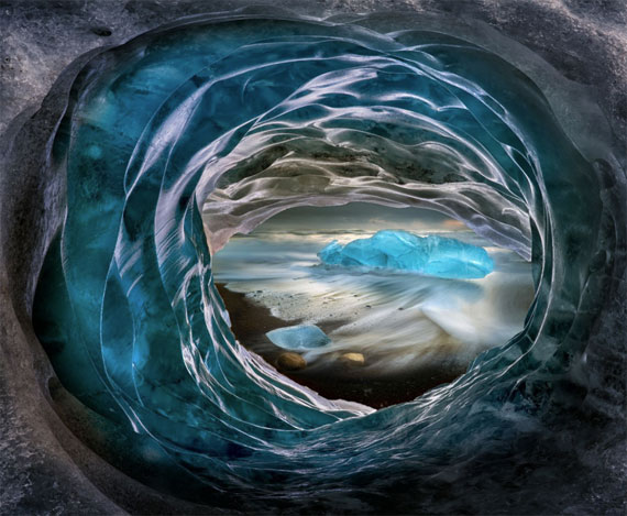
The iceberg was photographed at Black Sand Beach near Jökulsárlón and the ice hole that frames the subject was photographed just outside an ice cave, similarly near Jökulsárlón.
For me, photography is largely a two-step process – firstly the capture and then the post-processing.
Manipulating an image after its capture is a practice almost as old as photography itself. Before the digital age arrived, this was achieved by a range of techniques such as retouching with ink or paint, double-exposure, piecing photos or negatives together in the darkroom, scratching Polaroid’s etc and the list goes on.
The debate around image manipulation has been a topic of discussion since photography was born in the 1830s and the history of composite photographic images and image manipulation relates far back to the methods of Pictorialism* (1885–1915).
In the current realm of digital photography, Photoshop is my most favoured tool of choice for post-processing. As I have alluded to already, I find it is the most effective instrument for allowing me to develop an image from what I had previously captured into what I had witnessed, felt or pre-visualised.
There are other tools available, and more being created every day, but Photoshop still remains the original and current benchmark for unlimited creative potential. It has the range and power to refine, control, design and finesse an image in almost any way you can think of. Your level of imagination really is its only limitation!
Pre-visualization
The concept of pre-visualisation in photography refers to where the photographer can perceive the final image before it has actually been captured. This approach can be of high value for photographers of all kinds, as it has the potential to unlock greater creative vision.
Well before even flying to Iceland, I had been exploring a range of ideas in my mind. Iceland has been so heavily photographed in recent years and I really wanted to create something original and unique, beyond what I had seen before. Not an easy task perhaps, but a motivating one! One of my ideas was to photograph some of the most recognised and iconic locations, but present them framed inside ice, and this image was created from that idea.
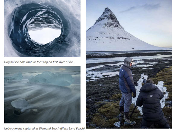
My first attempt to frame an icon within ice was at Kirkjufell mountain, framing the peak with a sheet of ice (see image above).
What works about this image
Overall the image has lots of rich texture and form to explore, providing interest in every part of the image, yet the circular framing creates a clear and controlled sense of direction and movement for the eye to follow. There’s a beautiful reward for walking inwards from the outside, held in the flowing movement and sumptuous colour deeper within. Ultimately, it is a fairly unique image of a well seen location with an alluring level of sensuality and spatial depth. I think the success of this image comes from how well the relationship between shape, colour and content has been tied together between the two frames. Let’s start with a view of the two original raw files and I will take you through some of my thought processes and techniques for blending
the final piece together…
Composition
Framing is a compositional tool whereby elements in the image are used to outline or enclose a feature within its boundaries. In this case the ice hole is used to encase and frame the background features of the icebergs at sea – creating a frame within a frame if you like. In this case it works particularly well because the iceberg is framed by another element in the scene that complements its own story and physical structure – essentially two slightly differing forms of the same element, tied together by design.
The original placement of the iceberg within the hole was too tight and it didn’t work compositionally. As a result, I used the warp tool in Photoshop to open it up and give more breathing room to the iceberg, which brought more balance to the two main areas of visual interest.
The compositional choices provide an organized arrangement within the frame, structuring the image more formally. Limits are set, and the image holds back from flowing over the edges. This containment provides a sense of stability, deliberateness and control – a common quality in a successful image.
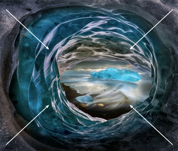
Circular framing creates a clear and controlled sense of direction and movement.
On a purely graphic level, the framing helps focus the attention of the viewer by establishing a clear direction for the eye to move from the outer frame inwards, through a visual passageway. The small gap between the two frames also intensifies the graphic relationship between the two scenes.
Circles and ellipses have a special place in composition. Unlike triangles, vectors and lines, they are not so easy to imply because they need to be complete and have a very precise, recognizable shape. The circular and elliptical elements in this image have an enclosing effect. They contain what’s placed within and draw the eye inward; in this case, creating a tunnel-like effect.
Lines and Curves
The leading lines in this image are less visible and more implied, but very effective nonetheless. The tunnel like effect of the framing denotes the direction of the converging lines that run from the outside to the inside through this visual tunnel. Converging lines have long been used to evoke depth and perspective, and do so here to significant effect.
The horizontal line on the centre of the image, within the frame, provides a familiar anchor and resting point for the eye and a point of reference to explore and relate to the rest of the image. It also provides a point of difference in the otherwise dominant circular features.
The rest of the image is largely made up of curves. Unlike linear features and lines, curves invite the viewer to slow their advancement through a frame visually. They add an earthy sensuality and lure the viewer into slowing down to investigate all the sinuous shapes.
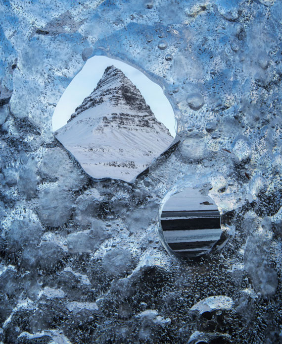
My first attempt to frame an icon within ice was at Kirkjufell mountain, framing the peak with a sheet of ice.
Patterns and Rhythm
There is a large repetition of form in the curved features along the icy tunnel walls, leading into the scene behind. This pattern evokes an almost wavelike rhythm as you wander gently up and down the ridges of ice, deeper into frame. When you finally reach the central scene the viewer is rewarded with a change of tempo and even sound through the washing waves of the sea.
Asymmetry
The visual weight of the image is slightly skewed rather than symmetrical in nature. The bulk of the ice presented is uneven, with greater weighting above and to the left of the frame.
This contributes to the feeling of movement and the organic living nature of the scene. A perfectly symmetrical positioning of the central subject and weighting distribution would be far more static in comparison. The horizon line is quite centrally placed however, which adds a subtle horizontal symmetry and sense of balance to the image overall.
Texture
This image is incredibly rich in texture, particularly in the ridges of ice on the walls of the ice hole. They feel so real and tangible as a result that you almost feel like you can reach out and run your hands over them. Texture has the power to evoke a very physical and sensory response to a subject and in this case, does well to describe visually just how it might feel to the touch.
Light
Selective dodging and burning has accentuated much of the shape and form of the ice features and aided in directing the light down into the deeper parts of the image. The eye almost always travels through an image to rest on its brightest point. The contrast and brightness of the icebergs in the back of the image has been increased to grab the viewers’ attention and help pull the eye through the frame. The outside of the image has been significantly darkened from the original, to add to the sense of framing (in a form of vignetting) to prevent any brightness on the outer part of the image competing with the elements designed to draw you further in. The lighting was handled with enough delicacy that you are invited to gently meander through the frame rather than be pulled through it by any overly bright features.
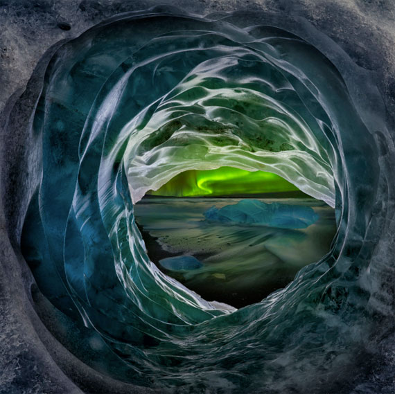
Another version of ‘Ice Hole’ including an aurora in the background.
There is a certain luminosity and translucence that has been conveyed by the use of light painted through the dodging and burning process, that really brings the ice to life. It also introduces a more surreal and painterly quality to the image
Colour
Many hours went in to developing and finessing this file, particularly with the colour, and several different versions were created. Ultimately, this variation rose to the fore where the blues were saturated similarly enough throughout the frame to help tie the two parts of the image together – while still keeping a subtle separation between front and back. Warmer orange hues (again with that beautiful colour complement to the blues) were added to the flowing water and horizon as well as to their ‘reflection’ inside the ice hole.

This added a touch more complexity to the overall colour palette, helped tie the two frames together, making it more believable and bringing a greater level of emotion into the image.
Movement
The front of the image is very static and solid, while the frame in the back, created with a long exposure, brings in an alluring sense of flow and movement. This subject contrast of the two
qualities in juxtaposition add a level of dynamism and interest to the image overall and introduce an added level of separation between foreground and background for the viewer to reflect on. This contrast is both literal and figurative in nature.
Tonal Range and Histogram
The histogram gives you an excellent view of where all the tones lie within an image. 0-255 represents the full range of the values involved from complete black to pure white. I rarely go to the edges, particularly when preparing a file for printing, as it usually means the brightest and darkest areas will not print with any detail – a common criticism from judges. And while it’s crucial to capture a photograph where the information is completely contained within this range, there is room to interpret how this is used and distributed throughout the final image.
Maximising the full range at your disposal within that boundary (I often aim for 10-245) allows you to take full advantage of the contrast, sense of luminosity and overall punch and impact for many images – with this one being an excellent example.
If you compare the original raw capture of the icebergs, the tonal range is very limited with low contrast feel and consequently it’s arguably a fairly lacklustre image in terms of impact. The final version is quite the opposite, largely through extending out the much fuller tonal range accessible within the file. The whites are whiter, and blacks blacker and there is a greatly increased sense of luminance, form and energy brought into the image as a result.
Technique: Focus Stacking
Like the image of ‘Spa Pool’, ‘Ice Hole’ was created using a photographic technique called focus stacking. 8 shots of the ice hole were taken focusing manually at different positions in sequence, from the foreground to the background using an aperture of f11. The eight images were then merged using the very capable specialist software: Helicon Focus. This technique generally requires the use of a tripod to prevent ‘ghosting’ or overlap of images during the blending process and to provide enough control to select the various focal points. Mirror lock-up and a cable release are recommended to avoid any unnecessary vibrations of the camera caused by manually touching the shutter-release button
“Successful composites look natural – as they should – but behind the scenes, you need to be prepared to spend the time required to create a seamless result. Putting the elements together is the easy part; getting them to sit together is more challenging.” – Peter Eastway
Reflections:
• This was a great example of rich reward from time invested. I gave a considerable amount of thought to creating an innovative image that stood out somewhat from the heavy flow of images that come from this highly visited area. Taking the time to be present with any visualised ideas and concepts, both before the capture process, will allow them some breathing room to guide you. Before I even bought my ticket, I was reflecting on ideas about how to approach this area. What were its qualities that I wanted to express? How could I explore it on another level? What was a new approach I could take?
• When I arrived, I used some time to test out the theory of my approach and put it into practise – as you can see in the imagery from Kirkjufell Mountain. It’s well worth some trial runs when you are using a new technique. Photography is a craft like any other and requires time and repetition to refine your skills!
• I thought I’d follow on with a note about Pictorialism that was mentioned above…
*Pictorialism is the name given to an international style and aesthetic movement that dominated photography during the later 19th and early 20th centuries. There is no standard definition of the term, but in general it refers to a style in which the photographer has somehow manipulated what would otherwise be a straightforward photograph as a means of ‘creating’ an image rather than simply recording it. It emphasizes photography’s ability to create visual beauty rather than simply record facts. Pictorialism began in response to claims that a photograph was nothing more than a simple record of reality and transformed into an international movement to advance the status of all photography as a true art form.
• I personally am a huge advocate for photography as a legitimate form of art. For me, it’s just the medium I happen to be using to express myself. It could have been a paint and brush or pencil and sketch book, but for me it’s a camera. It’s the ideas and vision that define where I want to go with my imagery, not the confines of the medium. I am only too happy to use whatever tools are available to establish what I wish to communicate through my image making and I stand by this.
For Further Training:
Ignacio handpicked a selection of landscape images that have received an array of national and international photographic awards and accolades to showcase and explore in depth key aspects of composition, technique, light and storytelling that help contribute to their success.
Dessecting Award Winning Landscape Photos
“My goal with this book is to share my knowledge, accelerate your journey to creating award winning imagery and hopefully save you valuable time and avoid much of the heart break I have been through in the process.“ – Ignacio Palacios
Found here: Dissecting Award Winning Shots
Like This Article?
Don't Miss The Next One!
Join over 100,000 photographers of all experience levels who receive our free photography tips and articles to stay current: