This is a complete introduction that will get you comfortable using and understanding the fundamentals of the curves adjustment layer. It will not go into any technical detail that you don’t need. Everything I explain here is useful for you to know when actually using the tool. The first section will be an overview of the Curves adjustment layer and its most important options/settings.
Curves 101
The second section goes on to give you some further practical, real-world usage examples, so you can put the theory stuff into practice. But before we get to either of those sections, the very first thing I want to do is give a quick explanation of the difference between the “Curves Adjustment” and the “Curves Adjustment Layer”.
The difference between the “Curves Adjustment” and the “Curves Adjustment Layer”
Many of Photoshops “adjustments” are available in 2 modes.
- As a regular adjustment
- As an adjustment layer
A regular adjustment is applied to a pixel layer in your Photoshop document and is known as a “Destructive Edit”, because it irreversibly changes the pixels of the layer it is applied to.
An adjustment layer is applied independently of any other layers, and by default affects the layers that are visible underneath it in Photoshops Layers panel. An adjustment layer can be added, adjusted, updated, duplicated, deleted etc independently of any other layer, which is what makes it a “non-destructive edit”.
For the purpose of this tutorial, we will be using the Curves Adjustment Layer because this is what I generally recommend everyone use most of the time. Only in very specific instances would there be a good argument for using the pixel-changing Curves adjustment.
Part 1: An Introduction to How Curves Adjustment Layers Work
How to Add a Curves Adjustment Layer to Your Image
You can add a curves adjustment layer to your image a few ways, but here are two:
In the Layers panel, click the “New Fill Or Adjustment Layer” button near the bottom (circled). Then choose the “Curves” link from the popup menu.
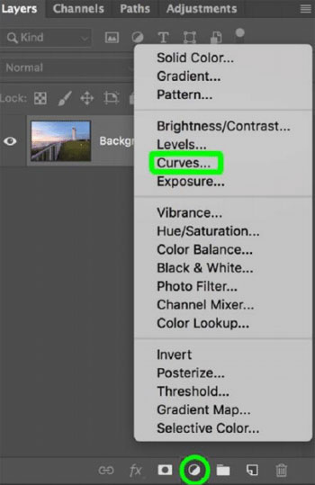
Choose curves
Alternatively, if you have the Adjustments panel open, click the curves icon within it (circled).
Curves icon
Fundamental Curves Concepts
Once you add a curves adjustment layer to your image, its properties panel will appear on screen.
If you close the properties panel at any time, you can re-open it by double-clicking on the adjustment layer in the Layers panel.
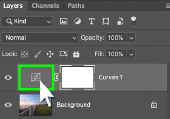
Double-click to re-open Curves 1 properties
The main area of the Curves adjustment layer properties panel contains a view of your image’s histogram, with a diagonal line running from bottom-left to top-right.
Throughout the rest of these instructions, I will refer to this diagonal line as “The Curve”, because we will be creating different “curved” shapes from this otherwise straight line to change the appearance of the image.
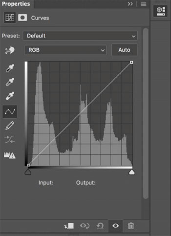
The Curves Properties Panel
To adjust the shape of the curve, we add control points to it (by clicking on the curve with the mouse), and then moving those control points up, down, left or right (by clicking and dragging a control point).
For example, to brighten the image you would add a point to the middle of the curve and then drag it upwards. To darken the image, you would move that same control point downwards:
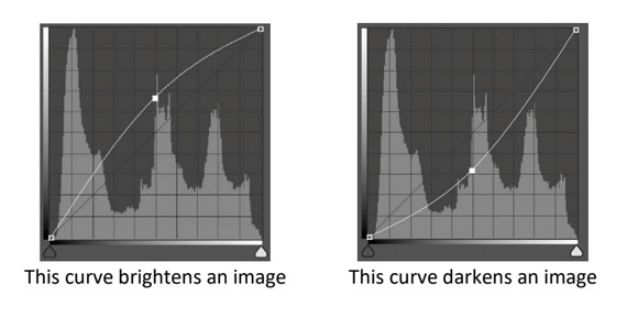
Brighten and darken
Shadows, Midtones, and Highlights
To explain what’s happening with each of the above curves, picture the histogram divided into 3 sections – Shadows, Midtones, and Highlights.
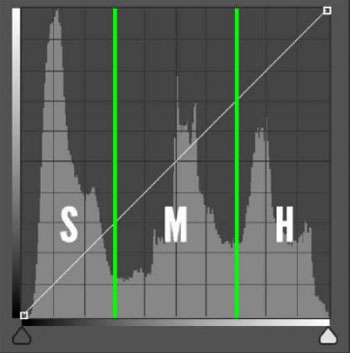
Shadows, midtones and highlights
In the above example, the control point was added to the middle of the curve, so it will be primarily affecting the Mid Tones of the image.
In other words, we are saying “Take this mid tone value, and make it brighter (by pushing it up) or darker (by pushing it down).”
Key Concept:
If the curve is ABOVE the original position, the image will appear brighter in that tonal range.
If the curve is BELOW the original position, the image will appear darker in that tonal range.
In the two example curves above, the entire curve went either above or below it’s original position.
However, it is possible to add multiple control points to the curve and push them in opposite directions so that part of the curve is above, and part of the curve is below its original position.
Which brings us on to…
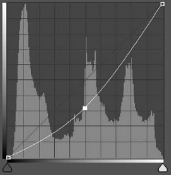
Creating an S-Curve to Increase Image Contrast
To increase contrast in an image, you need to create more separation between the shadows and the highlights in the image.
Or in other words, make the brighter pixels brighter and the darker pixels darker.
To do this with a curves adjustment layer, you would add one control point near the top of the curve (Highlights) and drag it upwards (to make it brighter), then add a second control point near the bottom of the curve (Shadows) and drag it downwards.
Here’s what that looks like:

Adjusting points
This adjustment is known as an “S-Curve” because it looks like a stretched-out letter S.
One of the key concepts of the Curves adjustment is this:
Key Curves Concept
- Steep curve = increase contrast
- Flat curve = decrease contrast
Now take a look at the angle of the curve between the two control points and notice how it’s on a steeper incline compared to its original position. This is what provides the increased contrast.
The opposite of this would be a fatter curve that decreases image contrast.
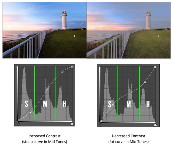
Increased contrast, decreased contrast
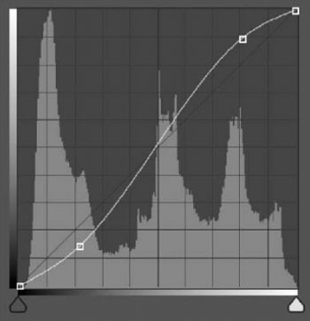
It is important to note that this this concept can be used as a general rule for general contrast adjustments in your images, but there is a little more to it.
Take the S-Curve above and notice how the curve is only steeper between the two control points that were added to the curve.
The curve is flatter in the shadows and the highlights.
So, whilst the overall image contrast has been increased because the curve is steeper through most of the tonal range, the extremes have received the opposite effect and lost contrast.
If this results in an undesirable effect on the image, then I recommend using layer masks to “hide” this effect in the shadow and highlight areas.
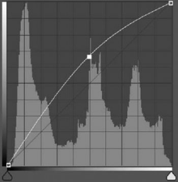
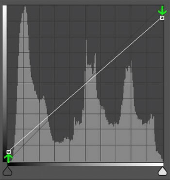
Altering the Black and White Points of the Curve
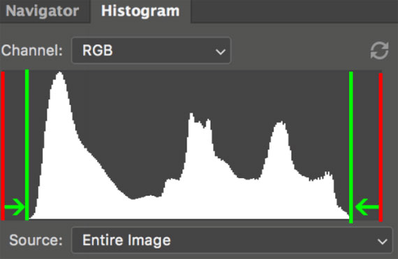
Sometimes an image can have a “compressed histogram” indicating that it’s very low in contrast.
By “compressed histogram” I mean that the image data is kind-of bunched up around the middle of the histogram and doesn’t extend all the way to the edges.
Here’s what that may look like:
Adjusting black and white points
The red lines are the black and white points of the histogram, but the data only stretches as far as the green lines creating a gap at either end of the histogram.
Luckily, there’s a simple way to correct this using the Curves adjustment layer!
The two control points at the very top and bottom of the diagonal line in the curves adjustment layer properties panel represent the black and white points of the tonal range of the image.
Simply drag the bottom (black point) control point rightwards until it just touches the first piece of image data in the histogram, and then the top (white point) control point leftwards until it just touches the end of the histograms data.
Like so:
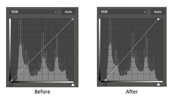
Before and After
See how this affects the main image histogram:
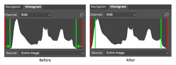
Before and After
The histogram now covers the full range of the histogram from black to white.
Note: This is a decent rule of thumb to keep in mind for processing your image, However, depending on the image, such an adjustment might not always be the best idea. For example, if you have a photo of a misty landscape that is naturally low contrast with no pure blacks and no pure whites, you wouldn’t want to make it over-contrasty by making this adjustment.
Adjusting, Altering and Resetting a Curves Adjustment Layer
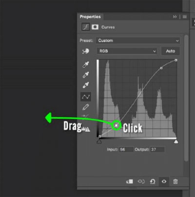
Adjusting a control point
You can adjust any control points you’ve already added to the curve by simply clicking and dragging it in any direction.
For a more fine-tuned adjustment, you can click once on a control point and then use the arrow keys on your keyboard to move it up, down, left and right.
Deleting a control point
To delete a control point, click and drag it all the way out of the properties panel window.
Click and Drag
Alternatively, you can click once on a control point with the mouse, then press the DELETE key on your keyboard.
The RESET Button
Sometimes you’ll want to scrap whatever changes you’ve made to a curves adjustment layer and start over. The most economical way to do that is by simply pressing the Reset button in the properties panel:
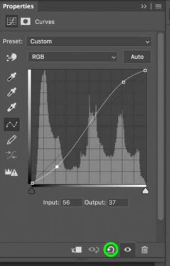
Reset button
Auto Curves
No doubt you’ve spotted the Auto button in the curves adjustment layer properties panel already. As you have probably guessed, when pressed, it makes an auto curve adjustment.
But what is it adjusting for? What is Photoshop trying to do when you click that Auto button?
It all comes down to a hidden set of options that you probably haven’t seen (because Adobe have NOT made it obvious how to access them).
To reveal the hidden set of Auto Curve options, hold the “Option” (Mac) or “Alt” (PC) key on your keyboard and simultaneously click the Auto button.
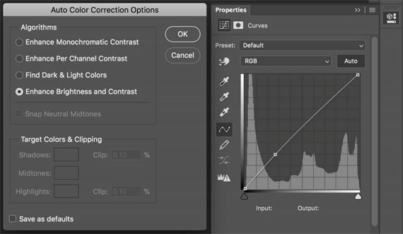
Auto Color Correction Options
When the Auto Curve options appear, you’ll see one of 4 options selected. This is your current default option that Photoshop will use every time you click the Auto curve button.
Unfortunately, the technical label for each option in the “Algorithms” section doesn’t really tell us in plain English what it does…
And when you hover the mouse over each option and wait for the tool tip text to pop up with the longer explanation, it only confuses matters even further.
Luckily, at the end of the long tool tip text description there is another short description that makes sense at a glance.
So for your convenience here’s the short layman’s description of each option:
- Enhance Monochromatic Contrast: Auto Contrast
- Enhance Per Channel Contrast: Auto Tone
- Find Dark & Light Colours: Auto Colour
- Enhance Brightness and Contrast: Content Aware Auto Contrast
The last one (Content Aware Auto Contrast) is like the first (Auto Contrast) except Photoshop analyses the actual image and adjusts the contrast, whereas the first option (Auto Contrast) makes its adjustments based purely on the histogram.
Also, when any of the first three options are selected, the “Snap Neutral Midtones” and “Target Colours & Clipping” options become active. However, for the purpose of this 101level tutorial, we can skip those for now and pick them up in a future tutorial.
You can toggle between the 4 options and see the effect of each one previewed on your image, with the actual adjustments to the curve previewed in the properties panel.
Then when you’re happy with one of the options click OK.
If you want to change the default value, check the “Save as defaults” box before clicking OK.
Adjusting the Curve in Individual Color Channels
The curves adjustment layer properties panel includes a dropdown box with options to select RGB (Default), Red, Green, and Blue.
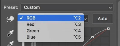
RGB
This gives you the ability to adjust the curve in the individual colour channels separately, which is useful for making colour corrections or creative adjustments.
For example, if your image has a green colour cast, you can select the green channel and drag the curve downwards.
Or if you want to increase the warmth in the highlights of an image, you can select the red channel, add a control point to the Highlights end of the curve, then push the curve upwards.
For the purpose of providing a practical understanding of adjusting individual channels for the time being (because there’s a more technical explanation than this, but it’s beyond the scope of this intro-level tutorial) don’t worry for now about the concept of “contrast” in the colour channels.
Simply use them to “add” or “remove” colours from your image by selecting the desired channel and dragging control points upwards to increase that colour, and downwards to decrease that colour.
I’ll give you some examples of this in the “Practical Applications” section of this tutorial.
Eyedroppers
The Eyedropper tools can be used to give you a kind-of semi-automatic contrast and colour adjustment.
In order from top to bottom in the Properties panel (circled) they can be used to set the Black, Grey, and White points in your image by clicking on parts of your image that “should” be those colours.
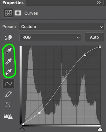
Eyedroppers circled
Let’s say you have an area within your image that should be absolute black, but it doesn’t look black.
To fix this, you would click once on the Black eyedropper tool to turn it on, then click once on the area in your image that should be black.
Same goes for White but using the White eyedropper.
This CAN work out of the box, but there is a problem.
Whichever pixels you click on in your image with the eyedropper tool, the curve will be adjusted to make those pixels absolute black, or absolute white.
That’s great, because the tool is doing exactly what you’re instructing it to do.
But if you just happened to click on a pixel that LOOKED like it should be pure black (or pure white), but actually it shouldn’t be that way or if you clicked on the wrong part of the image and made something black that shouldn’t be black, then you’ll end up with a curves adjustment that is clipping pixels in your shadows and/or highlights resulting in too high a contrast image with blown out areas.
This is why I personally don’t use these eyedroppers at all in my workflow. There are ways of working around this problem, but I prefer to make most of my adjustments by eye.
The grey point eyedropper is much more forgiving though and can be used to remove colour casts from your image in virtually one click.
With the grey eyedropper turned on, click on a colour in your image that should be neutral grey and the curves adjustment will update each of the RGB channel curves to make it so it is.
If you don’t have an area in your image that is an obvious candidate for middle grey, feel free to click around potential areas until you find one that creates a pleasing result, but if nothing looks right, then revert to adjusting each of the colour channels curves by eye.
Part 2: Useful Curves Adjustment Examples
In this next section of the tutorial, I will provide some examples of some common useful adjustments you can make with a Curves adjustment layer. These examples should be used as a guide for you to create similarly shaped curves from rather than duplicating their settings precisely.
Brighten an image
Add a control point near the middle of the curve and move it upwards. The further up you move it, the brighter the image will become.
Brighten an image
Darken an image
Add a control point near the middle of the curve and move it downwards. The further down you move it, the darker the image will become.
Darken an Image
Increase image contrast
Add one control point near the top of the curve and move it upwards to brighten the highlights.
Add another control point near the bottom of the curve and move it downwards to darken the shadows.
Increase image contrast
Correct colours in an image
Curves is a great tool for correcting colour casts in an image. You can do this by eye by adding or altering the red, green, or blue values in each of the individual colour channels within the curves adjustment layer, as mentioned earlier.
But here is another great way to correct colours that doesn’t rely on your eye knowing what looks right (because sometimes it can be very difficult to tell!).
Here are the steps to follow:
Step 1 (Optional)
Look at your image’s histogram. If there are gaps at both ends of the histogram, then move onto STEP 2.
If either end of the histogram is touching the black or white points, then do this:
Adjustment
Add a curves adjustment layer and then move the black point up a bit, and the white point down a bit:
Moving points
(Note how the diagonal line is now fatter, indicating a lowering of the image contrast as mentioned earlier!)
With a small gap at either end of the histogram, you’re ready to add the actual colour correcting curve.
Step 2
Add a new curves adjustment layer. Select the Red channel from the dropdown and then move it’s black and white points to meet the first bit of red image data in the histogram. Then repeat for the Green and Blue channels:
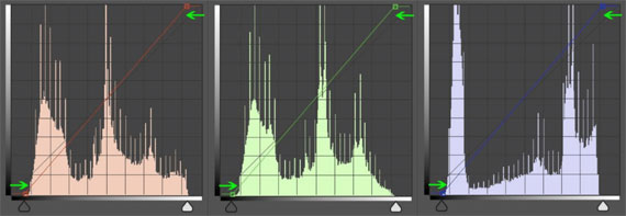
Repeat for other channels
If your image is of a colourful sunrise or sunset, you may find that this adjustment neutralises the colours too much, in which case feel free to tweak the individual colour channels curves to “put back” some of the desirable colour cast that it initially removed.
Add warmth to image highlights (great for sunrise / sunset)
Select the red channel in a new curves adjustment layer, then add one control point to the centre of the curve. Do not move this control point, because its purpose is simply to “pin” the curve in place at the midpoint so it doesn’t move when you add the next one:
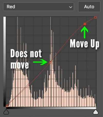
Adding warmth to image highlights
Add a control point near the top of the curve and move it upwards to increase the reds in the highlights of the image.
How to Take Your Next Step
This guide should get you up and running with using Curves adjustment layers in Photoshop in no time at all.
However, this really is just the tip of the iceberg compared to everything else that’s possible with Curves and all the other Photoshop tools that are so useful for Photographers to master and get the best out of your RAW files.
If you’re ready to take the next step in your Photoshop journey, then you might want to think about Steve Arnold’s full-length Photoshop 101 course.
There are over 6.5 hours of video tutorials included covering all the most important aspects of Photoshop for editing a landscape.
Photoshop 101 for Landscape Photographers (Learn More)
Do you want to discover the most useful parts of Photoshop for landscapes? We were able to arrange an exclusive 50% discount for our readers which ends soon.
Found here: The Photoshop 101 Course at 50% Off
Like This Article?
Don't Miss The Next One!
Join over 100,000 photographers of all experience levels who receive our free photography tips and articles to stay current: