I feel that contrast is probably the most important element in the entire world of visual arts. Let’s take a closer look.
Contrast is king
If Contrast was, in fact, the king of visual communication, then possibly he is only trumped by the beautiful Queen of Symmetry. We will take a look at symmetry at a later date.
If symmetry is the one element above all else that the human eye finds most attractive, then contrast would be the single element that the human eye finds the most interesting.
Contrast (Google definition)
noun
noun: contrast; plural noun: contrasts
ˈkɒntrɑːst/
1. The state of being strikingly different from something else in juxtaposition or close association.
Even the dictionary definition hints at the interesting quality of Contrast.
When we think about contrast within photography, we generally think about tonal contrast. Tonal contrast is what we photographers are referring to when we’re talking about adding or reducing the contrast within an image.
However, contrast by no means stops there. In fact, tonal contrast only just scratches the surface of the types of contrasts we can use to make our photography much more interesting.
This is not something I have pulled from thin air; the power of difference, variance or “contrast” has been around for as long as art itself.
How often have you seen a photo of the odd one out?
Google “Odd one out.” click on the image tab, and you will see the types of photos I am referring to. The interest that these images create is contrast at play.
Let’s break these forms of contrast into subgroups:
Compositional or in camera – types of contrast we can capture in camera.
Post-processing – types of contrast we can apply within post-processing.
Conceptual – Conflicting stories we can imply within our photography.
Compositional Contrast (contrasting elements)
Rough vs smooth
Sharp vs blurry
Still vs movement
Big vs small
Shiny vs dull
Old vs new
Square vs circle
Straight vs curve
Symmetry vs Asymmetry
Processing Contrast (contrasting effects)
Tonal contrast – high contrast vs low contrast
Light contrast – Dark vs light
Saturation contrast – High saturation vs low saturation
Colour contrast – Complementary, cold vs warm, others
Detail contrast – sharper vs softer
Conceptual Contrast (contrasting stories)
Happy vs sad
Many vs none
Have vs have not
There would be many, many more. I’m sure you have thought of a couple already; however, the point is, whatever we call it – contrast, variation, difference – is the foundation for interesting photography. In fact, there could be a case made that contrast is the foundation for almost everything interesting, full stop!
Compositional Contrast
Looking for contrast within your compositions can be an excellent way to improve the interest level within your photos.
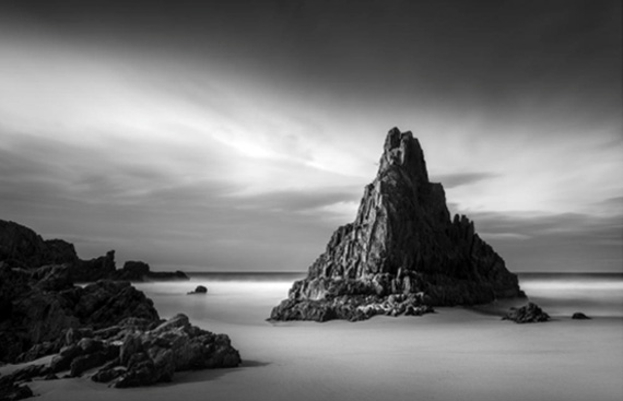
Above is a great example of compositional contrast. The first and probably the most obvious is the rough texture of the rocks vs the smooth texture of the sand and water.
– Very strong light contrast on the main triangular rock: light side v dark side.
– There is symmetry contrast with the strong symmetry of the triangular rock against the asymmetric position of that rock within the frame.
– Line contrast with the flat, straight horizon being broken by the rough outline of the rocks.
– Shape contrast: the strong triangle v the lack of any other shape.
– Shape contrast: the contrast of the triangle v the rectangular frame of the photo.
– The dark rock against the bright surroundings.
– The white soft line of the long-exposure water v the dark sharp line
of the horizon.
I would be lying if I told you that I consciously saw all of these elements when composing this photo. I can clearly remember that this position was the composition that jumped off the rear LCD much more than any other shot that I composed that day. This definitely has to do with the shape and symmetry of the pinnacle rock from this exact spot. The choice of shutter speed is also interesting because I will usually do several different speeds; however, more often, it’s the longer speeds with the smooth water that look the most interesting – the contrast of smooth vs rough.
Processing Contrast
When processing my images, the 3 main types of contrast I find particularly useful in leading the viewers are light, tonal contrast, and saturation.
Light (More or less light): As a type of contrast, light contrast would be the difference between a light area and an area of dark within an image. By adding light, we can attract attention to an area, or conversely by removing light or darkening an area, we will tend to divert attention from that area.
Tonal contrast (more or less contrast): Tonal contrast is the more commonly referred to contrast within photography. When photographers talk about contrast, we are talking about tonal contrast. Generally speaking, to add more tonal contrast is to create a larger distance between the light pixels and the dark pixels within a photo. Lighten the lights and darken the darks. To lower tonal contrast within a photo would be to create less distance between the lights and the darks. Darkening the lights and lightening the darks would reduce the overall tonal contrast of a photo.
Saturation (more or less colour saturation): Saturation as a contrast element would be the difference between highly saturated areas and the low saturated areas of a photo.
Attracting the attention of your viewer’s eye using these three forms of contrast is actually quite simple. By adding more of any of them to a specific area of our photograph (more light, more tonal contrast or more saturation) will have the effect of drawing attention to that specific area. Reducing the light, tonal contrast or saturation will have the opposite effect of allowing these areas to fade into the background, as these areas will appear less interesting to your viewers.
I must highlight the fact that removing contrast interest from the surroundings is at least as equally important as adding contrast interest to your main subject. In fact, in the case of saturation contrast, I will very rarely add extra saturation; however, I will almost always remove at least a little saturation from the areas surrounding my interest point (main subject).
Let’s take a look at another example where the above techniques are clearly visible.
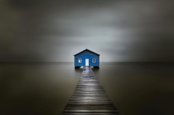
Hopefully, once again your eye is drawn to the boatshed in this particular photo.
Again note:
The centre of the image here contains the brightest areas, the highest colour saturation and also the highest area of tonal contrast (the point at which light and dark are at the closest proximity to each other).
Whereas the edges of the image contain;
– Very little, if any bright areas
– Next to no colour saturation
– Very little tonal contrast (Apart from the walkway leading into the photo)
Using these 3 forms of contrast, we can create very powerful photos that grab the viewer’s eye and lead it directly into the central subject matter.
Conceptual contrast
Conceptual contrast deals with conflicting stories or themes within a single photo.
To name just a few:
- Happy vs sad
- Despair vs hope
- Love vs broken heart
This is a relatively new concept to me and as I develop my conceptual contrast skills, I will revisit with more in-depth thoughts. In the meantime, let’s look at an image of mine where I have attempted to use conceptual contrast.
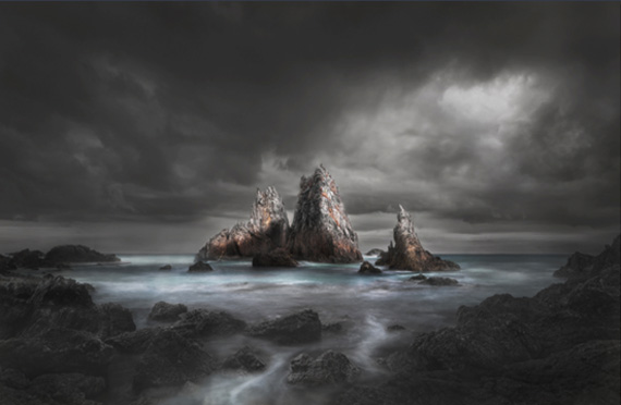
In this photo, the main conceptual contrast that I wanted to portray was quite a heavy, depressing scene with the ray of light representing hope.
There is also another possible storyline containing conceptual contrast, that being one of isolation v companionship. The three rocks themselves are quite isolated within the image, but within that, we also have the smaller rock of the three, separated from the embrace of the other two. Once again, I didn’t consciously see this at the time of making the photo. It all may seem a bit far-fetched, but at the end of the day, the more stories that we consciously place within our photos, the greater chance that our viewers will make their own interpretation and connect with our work.
Like This Article?
Don't Miss The Next One!
Join over 100,000 photographers of all experience levels who receive our free photography tips and articles to stay current:


Thank you for your articles. I have read a few and it is really incredible.