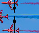
There’s a list of ‘rules’ regarding what makes a good composition and a pleasing image. Things like the golden ratio, the golden spiral, and the rule of thirds.

photo by Thomas Leuthard
What you have to keep in mind, though, is that these ‘rules’ are merely guidelines that work in certain scenarios. Understanding these rules will help you composite even when you’re breaking them!
Using these rules will give you a good composition, but as an artist what you’re after is great composition.
At the end of the day, composition is nothing more than an arrangement of colors, shapes, and tones in your finished piece—good, bad or indifferent.
So let’s delve a little deeper into some of these composition rules so that you can learn to both use them and discard them at will, depending on your vision.
Rule of Thirds
One of the first composition rules that we learn in photography and art is the rule-of-thirds.
The rule of thirds states that if you divide any composition into thirds—vertically and horizontally—then place the key elements of your image either along these lines or at the junctions of the lines. You’ll achieve a more pleasing arrangement.

photo by Rick Harris
This rule works because one element is made more dominant than another therefore drawing the viewer’s eye naturally to where you want them to look. Essentially making one area of your image more dominant creates interest and tension for the viewer, and they will have to naturally look at the rest of the picture to compare. The ‘thirds’ part of this equation is not really all that important, the main idea being the dominance of one element of your image over the rest. Like I said above, not really rules but guidelines.
The Divine Proportion
The divine proportion is often represented by the golden spiral. This is a guide that is used by artists and sculptors to achieve accurate representations and proportions.

photo by Robson#
People studying the golden rule have found it exists everywhere from Da Vinci’s Mona Lisa to the Pyramids.
Implied Lines
By creating strong ‘lines’ (not necessarily straight) in an image, we decide on the path that the viewer will take when looking at our image. When there are strong contours in place, the eye will follow them naturally from start to finish until it comes across another intersecting line and then follows that one.

photo by Bindalfrodo
Using this method, you can actually make your audience look at your chosen focal point immediately with subtle implied lines around the image literally ‘pointing’ to the spot.
Next time you come across an image or piece of art that draws you in, take a closer look and see whether some of these rules have been used. The answer will amaze you.
About the Author:
My crazy world has included successfully combining all the skills of an artist, photographer, designer, programmer, and marketer into one crazy life. I’m available for guest blogging, article writing, and speaking events. Follow me via my site or Instagram!
Like This Article?
Don't Miss The Next One!
Join over 100,000 photographers of all experience levels who receive our free photography tips and articles to stay current:


Leave a Reply