If you’re on the hunt for your first DSLR camera, or you’ve just purchased a DSLR and you’re new to digital photography, chances are you’ve been on the internet and watched one or two videos about things you should know or might want to know in order to get the most out of your camera—these are the basics or fundamentals type videos, of which there are a ton on YouTube.
In some of these videos, they may have talked about something called a histogram—usually telling you to look on your camera’s LCD screen, after you’ve taken a photo and see what the histogram is telling you, as a way to know whether your photo has come out properly or is otherwise either too bright or too dark, in which case you will need to make certain adjustments to your camera settings and try taking the photo again.
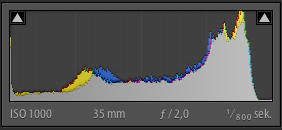
photo by Emil Oberg
All well and good, but let’s say you’ve watched one or two of these videos and are still a bit flummoxed as to how to interpret these histogram things. Well, this is the situation I found myself in for a few months. For a time, no matter how they phrased it, these different photography experts failed to get their know-how through my dense cranium. I hope to share with you how I eventually came to understand what these histograms meant and how they’re actually very simple to work with, once you understand their meanings.
Right, here goes…
A histogram is nothing more than a graph that tells you whether your photo has parts that are too bright (overexposed) or too dark (underexposed), to the extent that certain portions of your image data won’t be useable if/when you get your photo back into editing software, such as Adobe Lightroom, to finish processing your photos. Trust me, when shooting in the recommended image format referred to as RAW, it’s amazing how much detail even the most sophisticated modern camera lenses fail to reproduce.
It’s only when you get your images into a program such as Lightroom that you can adjust various settings to bring out the richness and depth of the colors, lights and shadows, which, thankfully, the camera’s digital sensor does manage to capture. It just needs software to tease it out. In the pre-digital era, photographers used to do this in the darkroom. Today, in the digital era, you don’t need to be in near total darkness in order to process your photos, you can do it in a nicely lit room, on your nicely lit computer…which is most probably the reason Adobe didn’t call their software Adobe Darkroom.

photo by See-ming Lee
So, getting back on track, at very right edge of the histogram graph, you have data for white. At the other end, over on the very left, you have the data for black. Everything else in between represents all the rest of the colors, or shades/tones of colors that can be present in any given image or scene. Each photograph you take will have its own histogram assigned to it. This is a graphical record of all the highlights, shadows and colors (of varying shades and tones) in that one image.
5 Histogram Exercises:

photo by Samat Jain
Try this simple series of five tests. This is what I did and it helped me understand what was going on with the histograms.
1. Put the lens cap on, take a photo, and look at the histogram. There should be a single line on the left of the graph, yes? If there had been all sorts of colors in your scene and you’re getting something too black or too dark, and if the lines of your histogram are mostly over on the left of the graph, then you’re losing detail and would need to make certain adjustments, such as decreasing the shutter speed, choosing a wider aperture, and/or increasing the ISO. All of these changes help to brighten up your image.
2. Now, take the lens cap off, and point the lens at something white (like a plain sheet of paper) and fill the frame with it (go up close, so that there are no other colors in the scene creeping into your photo). If you don’t have a piece of white paper or anything white to use, turn your ISO up to something like 1600 or higher, then turn the shutter speed to a really slow setting. Give it a good 30 seconds and point the lens at the lightest color(s) available to you (e.g. walls, ceiling, up at the sky, out of a window, etc.) and take a photo. When you look at your histogram, for this image, there should be a single line, or a very small bunch of lines, over on the extreme right of the graph. The image will appear white and the histogram data is reflecting this. The camera interprets this as an overexposed image. If there had been all sorts of colors in your scene and you’re getting something too white or too washed out, and if the lines of the histogram are mostly over on the right of the graph, then you’re losing detail, once again. Adjustments you might want to make include increasing the shutter speed, choosing a narrower aperture, and/or reducing the ISO (unless you’re already at the lowest ISO setting, that is). All of these changes help to reduce the brightness of an image.
3. With your camera still trained on that light subject (whether a wall or ceiling or piece of white paper), take a series of photos with ever faster shutter speeds. Then, look at the histogram for each respective image, and you should see the line or group of narrow lines gradually travel from the right side of the graph, over toward the left side (depending on how many shots in this test sequence you can be bothered to take). If you were training your camera on something white, then the images in the sequence should begin to look ever more grey.
4. The fourth test is to go hunting for objects with single colors, filling the frame with each object in turn, and then taking individual photos of these single colors. Photograph something red (filling the frame with this color, so your entire photograph is a mass of red), and there will be a narrow bunch of lines in this photo’s histogram slightly to the left of the very center of the graph. A photo that’s all yellow will have a bunch of lines further over on the right side of the graph, just over half way from the very center of the graph. Play about with taking photos different single colors, and their corresponding histograms should give you a better understanding of how the histogram is helping you to interpret individual colors in any given image.

photo by Jim Lukach
5. The fifth and final test is to take photos of anything you like. Introduce a variety of colors into your photos and see the wild patterns of their corresponding histograms. If the majority of the lines are bulked over on the left of the histogram graph, it’s probably telling you that your image is too dark (too underexposed) and you need to adjust your camera’s settings to brighten it up. Conversely, if the graph is mostly bulked over on the right side of the graph, then your photo is likely to be too bright and washed out (too overexposed) and you need to adjust your camera’s settings to reduce the brightness. If there is black in your image, such as a black car, then there will be a spike on the left of the graph, indicating the black color (this is fine).
After doing these tests, I felt significantly more comfortable checking my histogram and understanding what the graphs were telling me about the individual photos I was taking.
Hope this helped.
About the Author:
Graham Wadden created and maintains the Creative Commons photography website, WaddenCCPhotography, specializing in creating stock photography primarily for home educators and those in education.
Like This Article?
Don't Miss The Next One!
Join over 100,000 photographers of all experience levels who receive our free photography tips and articles to stay current:


Leave a Reply