When it comes to adjusting your contrast in Lightroom, the overall goal is to enhance the texture and interest of your photograph in a way that both supports your creative vision and protects your tones from unintentional damage, such as clipping your shadows or highlights.
Your contrast, clarity and texture sliders are your go-to tools for manipulating the value of your tones. However, I find that many photographers aren’t aware of the differences between these three too—specifically, when it’s appropriate to use one over the other. All three are tonal adjustments, but have very different results.
This article is a general overview of the tonal slider lessons from the Lightroom for Landscapes Program (currently 70% off), if you’d like to learn more on how to master the fantastic world of Lightroom.
Contrast, Clarity and Texture are for Enhancing Detail
The first thing to understand is that contrast, clarity, and texture all accomplish the same thing: they control the contrast between your tones. Or rather, how far away they are from one another on the value scale.
Increasing contrast will push those tones further apart (making your shadows darker and highlights brighter), while decreasing contrast will bring them closer together (reducing the gap between each pixel on the value scale). This is also known as low-frequency and high-frequency detail.
The eyes are naturally drawn to areas of high frequency (or high contrast), so adding contrast is a fantastic way to accentuate certain focal points and bring more attention to them. Inversely, reducing contrast will make a focal point less obvious, which is useful for when you want to divert attention away from distracting elements in your frame.
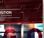
The Contrast Slider
The contrast slider is your most brute-force adjustment to your tones because it affects the entire tonal range, pushing your shadows darker and highlights brighter and plucking away midtones in the process—and thus losing detail. Although any kind of contrast increase will essentially remove those transition values, the contrast slider can be the most damaging.
This should be reserved for only the most dramatic adjustments, when there is very little contrast in your image to begin with. A little contrast will go a very long way, and thus you can more easily damage your photo with the contrast slider.
In the comparison below, you can see that contrast at 100 affects all tones globally, and is pushing some pixels beyond the dynamic range of the image (clipping detail).
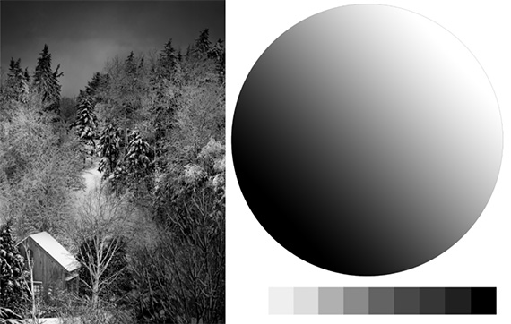
The original image
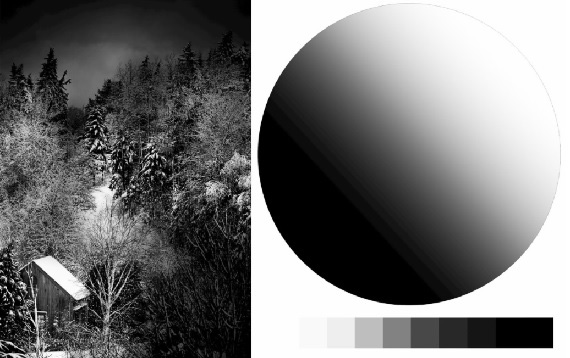
The image with contrast bumped up to 100
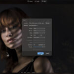
The Clarity Slider
The clarity slider is a bit smarter, and will focus on your midtone contrast rather than all values of your image. This means that your brightest highlights and darkest shadows will be somewhat protected since clarity will not pick them up for adjustment.
Clarity will also affect the transition area between each tone (the border where a pixel of one value meets a pixel of another value) and will add local contrast along those transitions to enhance the apparent depth.
Notice in the example image below, with clarity at 100, how each swatch now has a more three-dimensional appearance, despite the pixels within each swatch being of identical value.
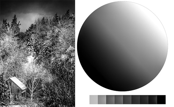
With the clarity slider boosted to 100
In other words, there is now variation within a specific value that enhances depth and texture. This is why the clarity slider can give your image a “glowy” or “cartoonish” appearance when used heavily.
And since clarity will target your midtones, it’s often useful to actually reduce the global contrast with the contrast slider—which will push your brightest highlights and darkest shadows more toward the midtones. This tactic can “feed” pixels into the tonal range where clarity is most effective.
The Texture Slider
Lastly, we have the texture slider. This is your finest contrast adjustment. It will enhance the detail of your midtones much like the clarity slider does, but will take it a step further and target only areas of high frequency.
If your existing texture is smooth (such as a cloudless sky or still water), adding texture will not benefit those areas, as there is no texture to begin with. The texture slider will take your existing contrast into consideration and will exclude low-frequency detail from the adjustment.
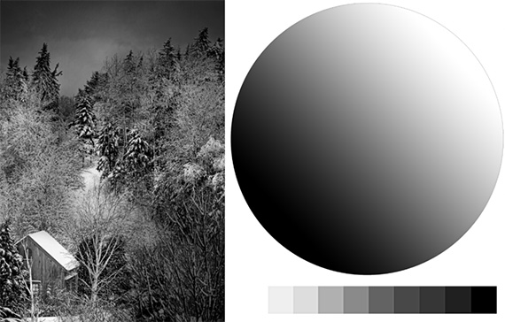
With the texture slider boosted to 100
We can see here that a texture increase of 100 has made virtually no difference in the value scale or the tonal sphere, since those areas are low-frequency (smooth with unvarying tones). The only exception, if you look closely, are the sharp transitions between each tonal swatch.
When adjusting contrast to enhance detail in Lightroom, it’s best to use the contrast slider sparingly—and only on images that have a lot of breathing room on the extreme ends of your histogram. The clarity and texture sliders will be your go-to tools for adding contrast intentionally and accurately.
For Further Training:
This article is a general overview of how to add depth and interest in Lightroom, but barely scratches the surface as to what is possible. The full in-depth program will walk you through all of the extraordinary tools and techniques that Lightroom Classic has to offer.
Lightroom for Landscapes (see inside)
Lightroom for Landscapes is currently 70% off today if you want to take a look. Learn a proven system for creating extraordinary, artistic photographs with complete confidence in Lightroom.
Deal ending soon: Lightroom for Landscapes at 70% Off
Like This Article?
Don't Miss The Next One!
Join over 100,000 photographers of all experience levels who receive our free photography tips and articles to stay current:


I find the curves panel much more useful than the contrast slider. It seems to work more like the clarity slider. Why was it not addressed in this article?