 Photoshop is a wonderful program that allows you to edit a photograph in as many ways as you can imagine. It allows you to control every aspect of a photograph and gives you editing tools that a traditional photographer could only dream about. With this wide range of editing and compositing tools comes the ability to create fantastic works of art.
With the rise in popularity of photography and personal computers, the door has been thrown open, now anyone with a half decent PC and a few spare dollars to buy PHOTOSHOP ELEMENTS can and are calling themselves RETOUCHERS.
In the hands of a skilled user Photoshop can produce awe inspiring work; in the hands of a novice it can produce images of extremely poor quality. Unfortunately, as the popularity of the program grows and people become more and more exposed to these poor images, this lack of quality is becoming accepted as the norm. Here are the things to watch for when creating Photoshop compositions:
1) Feathered edges. When you make a selection, using the dancing ants around an area you wish to move, change, colour or otherwise edit, you have to feather the edge by at least 2-3 pixels (depending on the resolution of your image), in order to avoid the jagged edges we so often see in photo montages. Feathering creates a soft edge that blends the area of the selection with the area it abuts. Feathering an edge by a high value is also a useful way to fade out a selection.
2) Correct Perspective. If you have one element in an image that has a different geometrical perspective that does not match the rest of the image the whole image will look odd. A viewer will generally not know what is specifically wrong with the image, they will just know that it looks odd and generally undesirable. This is generally seen in buildings or cars that have been composited in from other images and not had their perspective adjusted to match the greater image as a whole. This would happen if two images shot at different focal lengths were then combined. An image from a 28mm lens combined with an image from a 200mm lens will need perspective adjustment to look right.
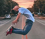
3) Correct Depth of Field. Images that have one object or area in focus and then behind that an object out of focus, and then behind that another object in focus will look very odd and be completely unbelievable. Like perspective, combining images shot with differing depth of field will require you to adjust the focus of the elements to correct the Depth of Field. One draw back, while it is possible to soften objects to make them appear out of focus or have short depth of field, it is next to impossible to sharpen soft objects to make them appear to be in focus. Depth of Field problems are one of the most common mistakes made in Photoshop compositions.
4) Direction of Light. When montaging images it is important to combine images shot with the same lighting conditions. The play of light on an object creates a series of shadows that have a specific directional play depending on where the light source was in relation to the object. If you montage together two images with differing light sources the image will look unreal and undesirable.
5) Colour cast. All images have a colour cast otherwise know as WHITE BALANCE, this is the HUE of the white areas. Also know as the colour temperature of an image. Be careful to adjust the colour cast of montaged images so that the white areas look the same, doing otherwise will render your images unreal and undesirable.
The human eye has an amazing ability to spot subtle changes in what it considers normal. Stare at a picture of a pink banana, after a short while the banana will start to appear yellow, but you will still have the feeling that something is not right. This also applies equally to Colour, Focus, Perspective and Light Direction. When creating montage images in Photoshop it is important to watch for mistakes in these areas as you will want to have your images look as real as possible and thus as desirable or aesthetically pleasing as possible. I have seen far too many images used in big advertising campaigns with blatant disregard for these basic principles. Done right Photoshop can create compelling compositions; done wrong and it just looks, well… wrong!
Sean David Baylis is a professional photographer who has been using the popular photo editing program Adobe Photoshop since 1994 version 2.5. He is considered by many an expert user and is called on to retouch major national ad campaigns and art books in addition to his own commercial and editorial work. Examples of Sean’s work can be seen at http://www.sdbphoto.com
Like This Article?
Don't Miss The Next One!
Join over 100,000 photographers of all experience levels who receive our free photography tips and articles to stay current:


You nailed it. Compositing is really simple when you keep all of these in mind. The depth of field is probably the trickiest to control because it’s very difficult to generate information from an out of focus element and using a softer or harder brush to match the material is only applicable if its convincing with the environment around it…
There is only so much you can do in photoshop with lighting and perspective. Some objects won’t look correct no matter how much “photoshopping” you do.
A couple of other things I’ve found very helpful in my own work is the use of convincing cast shadows from objects and adding noise to match the original picture. Masking hair is by far the toughest thing to do until you realize that painting in hair on a separate layer gets around the issue. For this specific thing having a tablet can be extremely beneficial.