Split toning is the method of adding different tones to the highlights and the shadows during post-processing. Landscape photographer Mark Denney feels that this is one of the most underutilized features of Lightroom. If you’re consistent with it, you can even develop your own signature style:
To demonstrate how split toning works, Denney simply uses a standard gradient map that goes from absolute black to absolute white. When he chooses a golden color for the highlights, and a blue tint for the shadows here’s how the gradient looks:
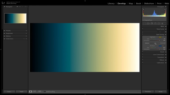
It is important to note that the extreme left and the right of the image are unaffected. This is because they are absolute black and absolute white and are not considered as shadow and highlight. Further, you can put greater emphasis either on the shadows or the highlights by using the “Balance” slider. Denney likes to leave it somewhere around -25 and +25 depending on the image. To put equal emphasis on the highlights and shadows, simply leave the slider at zero.
Working with Split Toning
Split toning works best for images that have a clear differentiation and distribution of shadows and highlights. The image below is an excellent example of where split toning can work well:
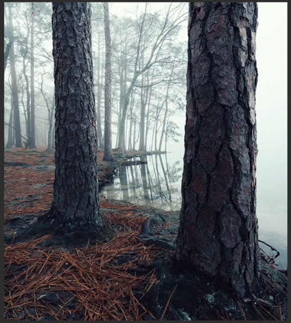
“When I took this photo, the sun was rising through the fog and had a nice warmth to it. But, it didn’t come across in the camera so I really want to add that warmth back in.”
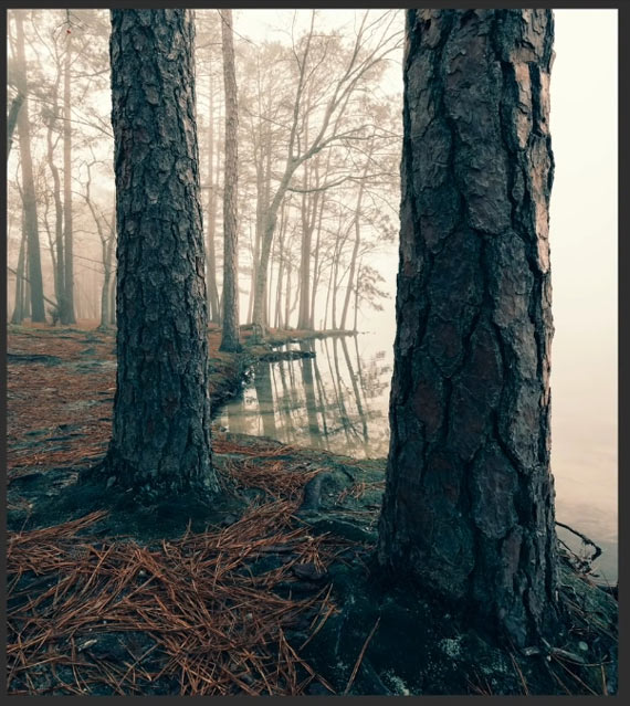
Denney uses the split toning technique to add some warmth to the highlights and refers to the color wheel chart to add a complementary color to the shadows. Here’s how he uses the split toning tool step-by-step:
- Holding the option (Alt) key, he slides the hue slider around in the highlights section to get a feel of the various colors. He settles for the golden color that was close to what he saw when he shot the image. Alternatively, you can use the eyedropper tool to pick from a gradient of colors.
- Next, he sets the saturation of the golden color by sliding the saturation slider.
- Denney suggests that you use complementary colors for the shadows and highlights. If you don’t have the color wheel memorized, you can look for it on Adobe’s website. Referring to the color wheel, he applies a teal color for the shadows in the same way he did for the highlights.
- Finally, to emphasize the highlights, he slides the balance slider slightly toward the right.
Denney solves the problem he was having with his image by adding warmth to the image. Even a subtle split toning effect is able to change the overall look and feel of the image.
Besides solving problems, you can use this split toning technique to create a signature creative style of your own. By adding a bit of creative touch to your images, you can set your impression on the viewers. For this purpose, you can create a preset for your split toning combination and quickly apply it to any image that you like in a consistent manner.
Like This Article?
Don't Miss The Next One!
Join over 100,000 photographers of all experience levels who receive our free photography tips and articles to stay current:


Leave a Reply