There are a lot of tricks to proper portrait photography, and whenever I think I know them all (or close to that) I stumble upon one that I had no idea about. Moiré is a concept I always noticed, but never knew was a thing. Thankfully, this video from Adorama is here to explain to everybody what moiré is and how to avoid it:
Basically, moiré is an effect that happens when you combine two different fine patterns. In the video, it’s the pattern on the model’s shirt, combined with the pattern of pixels in the camera. I personally think the effect is similar to the way oil (or an oily substance) looks when dipped in water.
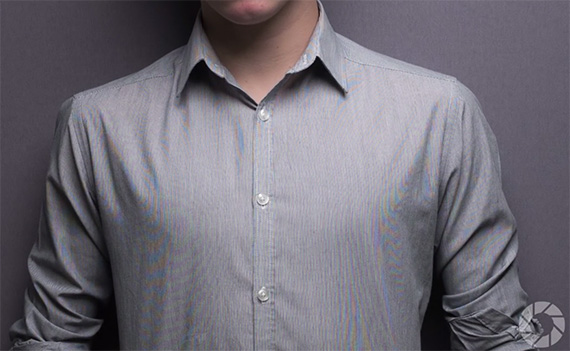
Moire appears on the model’s shirt because of the small pattern.
It doesn’t just appear on textile textures, either; this effect can happen with buildings or anything with fine pattern.

If you’re like me and you can’t spot the textures that will spawn this effect, there’s a quick check that will let you know while you’re shooting: take a test photo and zoom in on it on your camera. If while zooming in at 100% (or more) you can see this effect even on the camera’s display, you’ll know that there’s a problem there.
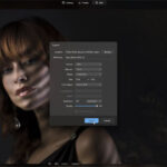
How to Reduce Moire
One of the solutions is to change the camera’s aperture settings. At f/5.6 or even at f/8, the moiré is there in all its glory. Changing the settings to f/11 reduces the issue, but not completely so. Zooming in a bit will totally reduce the effect. The problem with this solution is that you can’t always use it, depending on what you’re shooting.
Thankfully, there is a post-processing solution that can help you out even further. In Camera Raw there is the convenient Moiré Reduction tool that can help out with this issue specifically. Using this brush to paint over the areas affected by the Moire will reduce the effect to the point that it’s not noticeable at any resolution. It’s worth noting that overdoing it with this tool will make some areas of your photo actually look worse, so this needs to be used in moderation.
Have you encountered this effect in your work? Do you know of other solutions that would work better?
Like This Article?
Don't Miss The Next One!
Join over 100,000 photographers of all experience levels who receive our free photography tips and articles to stay current:


Louis – did not see a reply so I’ll tell you what I know.
Lightroom has the same sort of moire tools that are in Camera Raw.
I personally have had little luck with those tools, and wind up using photoshop as described here:
https://www.lifewire.com/remove-moire-patterns-from-scanned-photos-1700238
Good luck!
Hey there…, great post!!! Do you know if there is a similar Moire reduction tool in Lightroom or Photoshop? Thanks so much for your post!!! I also didn’t know that reducing the aperture size will also help reduce the moire.., so great tip there too!
Louis Joseph
NYC fashion and beauty photographer
http://www.louisjosephphotography.com/nyc-fashion-photographer-in-nyc-manhattan-brooklyn-for-fashion-beauty.html