Besides grabbing viewers’ attention, colors add a sense of mood, emotion, and drama to an image. In this video, landscape photographer Mark Denney shares seven tips for editing and enhancing colors in landscape photos using Lightroom:
1. White Balance
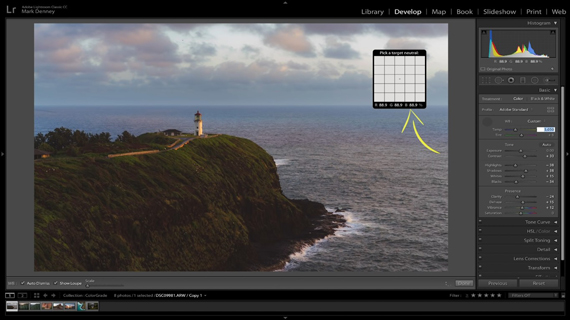
White balance is essential for an accurate representation of colors. If the white balance isn’t set correctly, the image will appear either warm or cool. And identifying the correct white balance to use in Lightroom is not that easy either. Selecting the “Auto” white balance feature seems to add too much warmth to a landscape image.
Here’s how Denney likes to set his white balance:
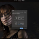
- Select the white balance dropper tool.
- Find a neutral area in an image and place the dropper over it.
- See that the RGB values that appear below the grid are as closely aligned as possible.
- With the temperature highlighted on the right side, increase or decrease it to make the RGB values as close to each other as possible. In Denney’s case, since blue had the greatest variation, he added more blue into the image by decreasing the color temperature.
“This is a way to update white balance from a technical perspective.”
You don’t always have to leave your white balance after setting it this way. You can either cool it down or warm it up to match what’s in your vision.
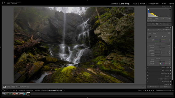
2. Profiles
Lightroom has a lot of profiles built into it and they’re quite powerful. And what’s cool about profiles is that they’re non-destructive. That is to say that applying a profile doesn’t make any changes to your settings. They all remain unchanged. After loading any of the profiles, it sets the profile as a starting point for your editing.
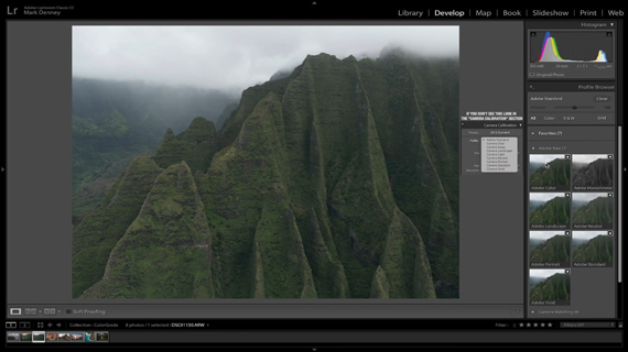
- Adobe Color improves the rendering of warm tones and adds a little bit of contrast.
- Adobe Monochrome creates a better tonal separation, which is a great starting point for black and white.
- Adobe Landscape creates more vibrant skies and increases the tones in the trees and grass, which is great for landscapes.
- Adobe Neutral is great for images with high dynamic range scene. It’s a low contrast, flat looking profile which provides greater latitude for post-processing.
- Adobe Portrait is optimized for better skin tones.
- Adobe Vivid comes in handy when you’re going for a punchy, saturated look.
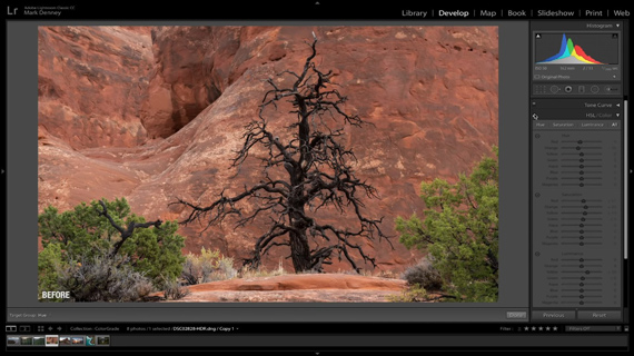
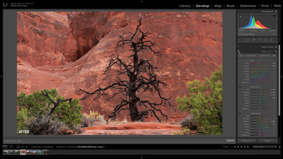
3. HSL Panel
If you are not familiar with the HSL panel, you’re missing out on a major way to have control over color in Lightroom. It simply stands for Hue, Saturation, and Luminance. The HSL panel is quite powerful in a sense that it allows you to change the hue, saturation, and luminance of individual color channels.
If you’re not sure which color channel you should be making changes to, simply grab the color picker in the HSL panel. Then, click on the area where you want to make the adjustments and without releasing the button, drag the mouse up or down to increase or decrease the setting.
Another handy tip is to update the luminance of the colors for which you have updated the saturation.
4. Camera Calibration
The camera calibration panel gives you to control over how Lightroom reads the data on the shadows and the hue and saturation of primary red, blue, and green color channels.
“I very rarely ever touch the hues on any of these. And nine times out of ten, the red channel is really the only channel that I even mess with.”
As the name suggests, the saturation slider affects the intensity of red, blue, and green. However, if you increase the saturation, you will notice that the effect is very subtle compared to increasing the saturation in the HSL panel.

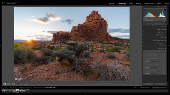
While you won’t need to make changes to these settings for every photograph, you can give it a try and see how it affects your image.
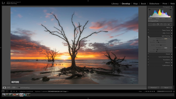
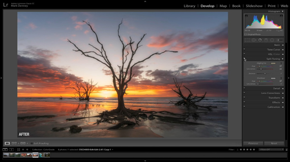
5. Split Toning
Split toning lets you to add a specific tone to the highlights and the shadows. By allowing you to have independent control over the highlights and the shadows, split toning lets you add more drama to the image. Here, you’ll find separate sliders to choose the hue and saturation to add to the highlights and shadows separately. When trying out split toning, you don’t want to make it too obvious. So, make sure that you’re subtle with it.
6. Tone Curve
While you can use the tone curve to adjust the amount of contrast in your image, did you know that you can use it to control the colors as well? Simply head over to the tone curve panel and in the channel section where it says RGB, choose the individual color channel that you want to adjust instead.
Then, if you use the color picker and hover it over your image, an anchor point will appear in the histogram that indicates exactly where the color being sampled by the color picker lies on the histogram. This removes the guesswork from your workflow. In the region where you want to make any changes, simply click and hold, and move the mouse up or down. Moving the mouse upwards adds the particular tones while moving down removes it.
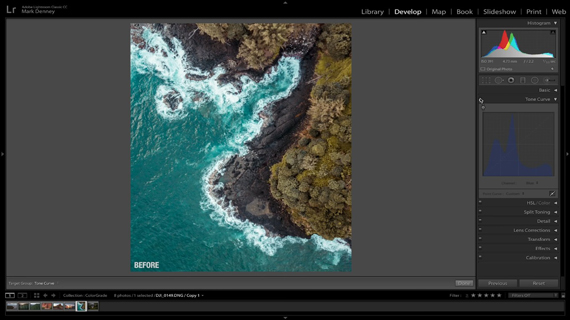
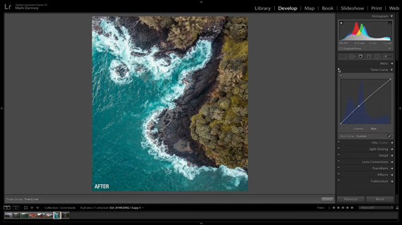
“This is another great way to find your own creative style by introducing certain tones in certain components of your image.”
7. Vibrance and Saturation
Using the vibrance and saturation sliders is the most common way to adjust colors in an image. But do you know the difference between the two?
“Vibrance increases the intensity of the more muted colors and leaves the already saturated colors alone. Saturation is a global increase in intensity of all the colors in your photo regardless of the starting point of the colors.”
You can say that vibrance is a smarter tool as it affects only the muted colors more. And since you’ll have no control over what the saturation slider will affect, you’d be better off using the HSL panel instead to fine-tune your saturation.
If you’d been feeling let down by the colors in your landscape images, these handy tips will definitely be of help. You don’t need to use all of them in a single image, but give some of them a try and see how your landscape photos improve.
Like This Article?
Don't Miss The Next One!
Join over 100,000 photographers of all experience levels who receive our free photography tips and articles to stay current:


Leave a Reply