Ever notice that when you try to blur a really colorful image in Photoshop or Instagram, you end up with a dark, ugly line between colors? We wouldn’t see that line in real life, so why does it appear on the computer? MinutePhysics tells us why this dark boundary shows up and explains the mathematics behind color blending on computers:
If we were to look at out of focus scenes and images in real life, the colors would blend smoothly into each other. But, for some reason, when a computer tries to use transparent edges or blur an image, this really obvious dark boundary creeps in between the colors.
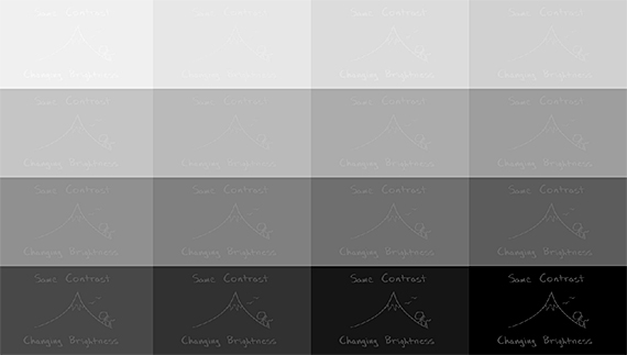
Dark bands appear where two colors intersect.
This is because of how we perceive brightness.
“Our eyes and brains are simply better at detecting small differences in the absolute brightness of dark scenes, and bad at detecting the same differences in bright scenes.”
Humans and computers detect brightness differently.
Computers, however, don’t detect brightness the same way we do. They only count the number of photons hitting a photodetector, so additional photons register the same increase in brightness no matter what the surrounding scene looks like.
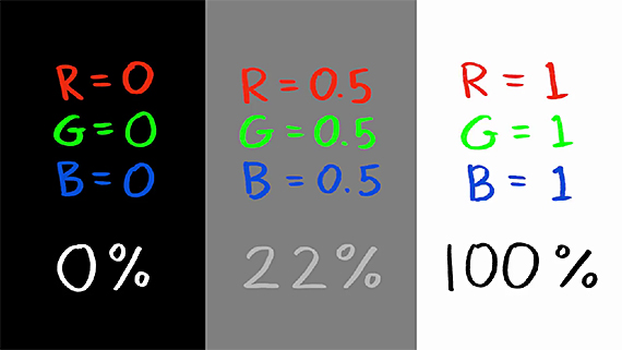
Basically, when a digital image is stored on a computer, the brightness value of each color at each point of the image is recorded. Zero represents zero brightness and one represents 100% brightness. With this logic, you would think that 0.5 brightness would be half as bright, right in the middle of the two colors, the perfect blend. Well, not so.
Take a look at this example. Because of our logarithmic vision, half brightness might look right, but in terms of absolute physical brightness, it has only 1/5 as many photons as white.
Back in the early days of digital imaging, in an effort to save disk space, software engineers took advantage of the fact that we are better at detecting small differences in the brightness of dark scenes. Instead of storing the brightness values in an image, a digital camera stores the square roots. Then, those numbers are squared back when the image is displayed on a computer screen.
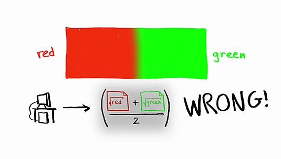
That shortcut works fine until the image is modified.
Since blurring works by replacing each pixel with an average of the colors of nearby pixels, when you take that average can really alter the results. Most computers average the brightness values of the image file. That’s the wrong way to do it.
They’ve forgotten that the actual brightness values were square-rooted by the camera. The result is an image that is too dark.
A Simple Fix to Correct Computer Colors
In order to correctly blend the colors, computers should first square each of the brightnesses to cancel out the square-rooting done in camera, then average them, then square root it back.
The default setting in Photoshop is set to the incorrect method, but there are advanced options to change that.
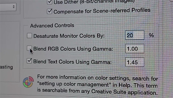
Change your color settings in Photoshop.
So, if you find yourself grimacing at your recently edited image because the beautiful, bright colors that first appeared now have this weird brownish line running between them, you don’t have to do the math yourself to fix it. Just go into Photoshop’s advanced settings (Edit > Color Settings), and change the color blending by checking Blend RGB Colors Using Gamma.
Like This Article?
Don't Miss The Next One!
Join over 100,000 photographers of all experience levels who receive our free photography tips and articles to stay current:


For proper color blending in CS6 blur, this setting (as reported above) seems to do nothing. What does work is switching the image mode to 32 bit. If you switch back to lower bit depth, be sure to use plain Exposure and Gamma – local adaptation/etc will result in a wildly changed image.
Hell of a workaround for something that should be easier (or even the default behavior!).
Nullhogarth, It seems to work on layer blending but not on stuff like blur effects. Try making a solid red layer, and a layer on top of it with a green gradient. You should see the a clear difference between the settings with that.
Actually – I’m using CS 6 here – the “fix” doesn’t work at all. It doesn’t matter whether you tick the box that says to blend RGB colors using gamma or not, the result is the same. I created two adjacent blocks of solid red and green for the test, then used the Gaussian Blur filer on the image. Whether the gamma method of blending is chosen or not, the result is the same – a dark blob between the red and green areas.
We need a better fix.
The fix is described in the article (last paragraph), not in the video. The video is made by someone else and just embedded in the article since it’s a good primer on computer colour.
Can this be done in Photoshop Elements?
I’m wondering why Photoshop doesn’t already default to the correction mentioned. Anyways, great Photoshop tip!
Interesting post with two problems. First, the bass “music” is completely unnecessary and annoying. I really don’t understand why so many people feel the need to overpower and distract from the spoken words. If you are saying something worth listening to, let people hear it clearly. Second, the title of the post is misleading. It says there is an easy way to fix this, but there’s no indication of how to do it other than glossing over the topic for five seconds at 3:20. If you meant there’s an easy way for software companies to fix it, don’t use a headline that suggests that *users* can easily fix it.