The appropriate use of color in photography adds a dynamic element to your images that is very pleasing to the eye. The correct use of it will allow you to create photographs to be proud of. Bold colors and bright composition in your photos result in images that sell. So use color to your advantage.
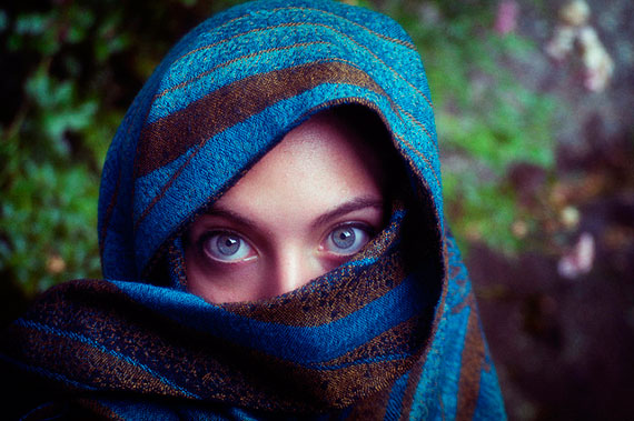
Photo by Isabelle Gallino; ISO 320, f/4.0, 1/125-second exposure.
I have always used strong colors in my images to good effect, allowing the image to speak to the viewer. We think and feel in color, which makes it obvious that well utilized color draws the eye of the viewer. Here are some keys to understanding and using color more effectively in your photos.
1. Dominant color
At one stage I thought that filling the frame with lots of bold colors would make a dramatic image. Not so. Colors that clash cause confusion to the eye and result in a poor image. Too many clashing colors create multiple focal points, causing the eye to dart around the image not sure what to look at first or what to focus on. Rather, choose one dominant color that becomes the focal point of the image and draws the eye of the viewer to it immediately. The greater the intensity of the color, the more it’s going to dominate so be careful that your subject in an image has the dominant color, otherwise a secondary subject could overshadow it because it has a dominating color.
2. Color isolation
It’s very important to isolate colors when trying to create a dramatic image. Using a telephoto or zoom lens will allow you to isolate a particular part of a scene that has a striking color or combination of colors. Another technique is to use your feet and change the angle of view so that the color is isolated from its surroundings. Getting in closer helps and allows you to combine colors that are more interesting and work well together, e.g. contrasting or complementary colors.
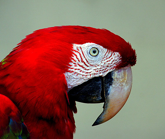
Photo by Bernard Spragg. NZ; ISO 400, f/6.3, 1/125-second exposure.
3. Advancing colors
This was an interesting concept the first time I read about it. Colors at the warm end of the color spectrum stand out and demand more of our attention. They are said to be advancing colors. Take red for example, it is strong and bold and when viewed in an image tends to dominate through its boldness and rich color. You’ll notice how strong it is when you have a scene that has only a little red, like a postbox, and yet it still has a dominating effect on the overall image. Yellows and oranges have a similar effect although they aren’t as strong as red. So be aware of advancing colors so that they work for you and don’t upset an image. Another example would be a bridal scene where a red object is part of the image. It will take the attention off the bride so be aware of this.
4. Receding colors
This concept is opposite to advancing colors. They take a background role and are more like supporting actors in a film cast. They like the background and add to the scene creating beautiful images. This is why blues and greens, the more cooler colors, work so well as backgrounds. They recede into the distance and help other colors stand out. Large areas of blue sky do this together with rolling green hills. Use them effectively and you will have great photos.
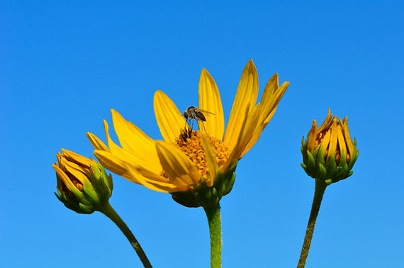
Photo by Joshua Mayer; ISO 400, f/11.0, 1/640-second exposure.
If you are prepared to take these techniques and incorporate them into your photography on a regular basis as you learn digital photography more effectively and the resulting images will improve dramatically. Happy shooting!
About the Author:
Wayne Turner has been teaching photography for 25 years and has written three books on photography. He has produced 21 Steps to Perfect Photos, a program of learner-based training using outcomes based education.
Like This Article?
Don't Miss The Next One!
Join over 100,000 photographers of all experience levels who receive our free photography tips and articles to stay current:


Your article is really interesting and it echoes with my own experience in photography. When working on Lightroom to prepare pictures for Clients, i am always wary of red objects. In my case, for landscape photography, a people wearing a red t-shirt can easily drawn attention even in the far background!
i agree to your comment David Saffir. and you gave a good hint of the complementary colors. every photographer should know about basic and complementary colors without to think about it. but the color wheel is a good tool already.if i would have a complain is the titel of the articel. i would say; Color and Color dominance would be might better. understanding colors as itself in photographic have a huge spectrum, while the very good article just point a small part of it.
It’s so crazy how the eye is attracted to certain things/colors. This article was very eye opening and super helpful! Now the hard part is to put it to use. I’m constantly searching for ways to compose a couple or a bride uniquely to try to stand out from the thousands of other wedding photographers in my area. I’ve never really thought about using color to stand out in the crowd but now I’m definitely going to be doing some searching for cool locations plus give more input to my couples as to what colors to wear.
Great read!
Thanks.
Some of what you said got me thinking about color in photos. If the colors in a photo are of one certain family, and there is one area that’s a warmer tone of that color, will the viewer’s eye naturally be drawn to that point? If so, that’s just one more thing that we as photographers can use to make sure the viewer focuses on the most important element in the shot.
this is one of the better articles I’ve seen on this topic. Really helpful!
I’d like to mention that a designer’s color wheel – one which shows complementary colors, for example, is an often-overlooked bit in the toolbox – one that can help photographers in their color compositions.
David Saffir
Gurushots.com – Personal Photography Tips from the Pros